

How to Talk to Customers: An Experience With a Shower Cap
Posted By

But here’s the thing: I didn’t even know I needed a new one. It hadn’t crossed my mind that there was a better alternative out there. I wasn’t hunting around trying to find one to buy.
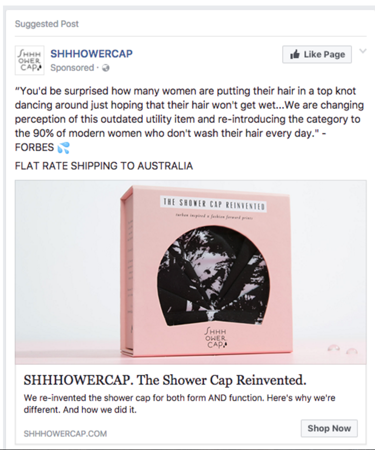
No, I was scrolling through Facebook and saw this ad which convinced me I needed to consider it.
As a marketing consultant, I advise my small business clients to focus on getting to know and engaging with their target market. There are a lot of theories and opinions about how best to approach your audience, but the best combination is expert guidance combined with a testing mindset.
This approach to testing means that I’m always curious about what others are doing. I scroll past many ads on Facebook every day. I’m always shocked when I’m tempted to click through—they must have got something right to get through my marketing filters.
This paid ad was instantly engaging and I wanted to find out more.
Why? Because I didn’t feel like I was being sold to:
- They described my situation with imagery that I recognized (dancing around with a top knot trying not to get wet hair).
- They used a stat that I could relate to: I am one of the 90 percent of women who don’t wash their hair every day.
- They also addressed a common concern about high shipping costs for products from the USA by saying in capitals that it would be a flat rate to ship to Australia.
Seeing the ad also reminded me of a comment that my husband made about my current shower cap, which my mother-in-law had purchased for me a number of years ago when he likened it to a “golden cake tin.” I didn’t like it, but as far as shower caps went it did the job. Not particularly well, but it was as good or bad as any other shower cap. Middling function over form is one way to describe it.
Not much point buying a new one because they were all the same: unflattering, not in any way stylish, but functional.
But here, in a Facebook ad, was the unexpected promise of a new product that would do a better job and look fabulous. There was no hesitation, I clicked and landed here on their website.
This page confirmed that I needed this product. Problems I couldn’t have explained but recognized were named—and then they explained how they’d fixed or reduced them. They knew my problems better than I did: They said theirs wasn’t noisy, it stayed put, and wasn’t made of plastic, which meant it fit better. All desirable.
So I bought one with an intention to buy more as gifts if it was as good as promised.
And I’m not the only one. According to Forbes, the company sold over $15,000 worth of shower caps in their first 10 days. At $43 each, that’s nearly 350 or 35 per day.
What worked? Why was I (and many others) so quick to whip out a credit card?
Why did it work?
Shhhowercap understood who they were talking to
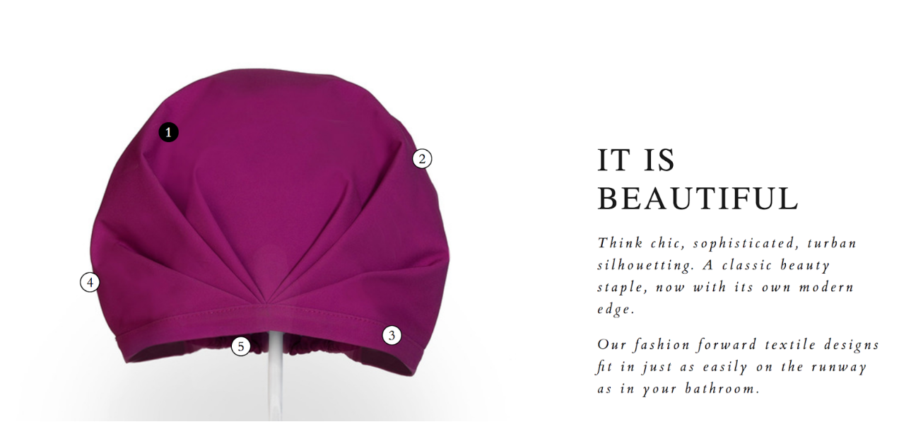
They used humor and good imagery to connect. We all know shower caps are kind of ridiculous (though useful) and old-fashioned. They didn’t shirk away, but rather gave a nod and then emphasized how different their version is, right on the Facebook ad. Nice contrast.
Once I clicked through the ad to their website, they went through each of the key drawbacks of typical shower caps and explained why the current widely used version is inferior. They could have just focused on the way they improved appearance, and promoted hard based on that. But they didn’t because they understand that, while their audience cares about how they look, the price differential of around four times more, and their value proposition needed more explanation.
They identified that their target market would probably want to have a full understanding of why Shhhowercap was better before they would be willing to purchase.
They made it easy to buy
The process from “add to cart” to order confirmation was quick and painless. Checkout is broken down into a number of steps to maintain focus, but with each area an expanding, accordion-style section. This meant I didn’t have to go from one page to another, it was just each section expanding when I was ready. Easy.

They used clever packaging
When the item arrived, the packaging looked great and had a deluxe feel to it.

What made it clever, though, was that it reiterated the problems that the product solved.
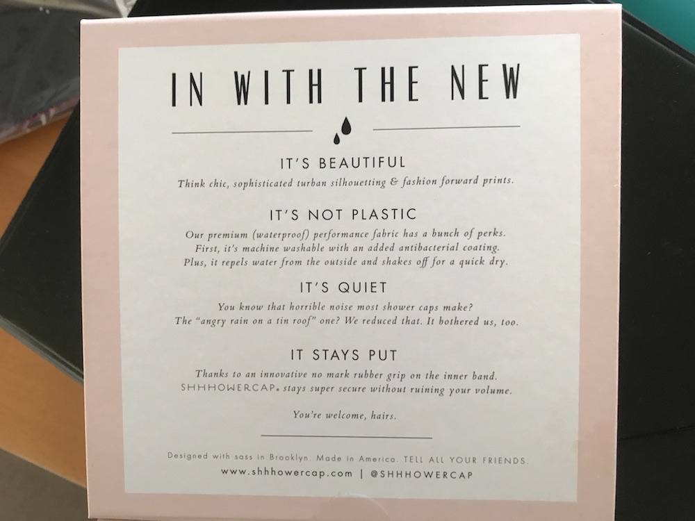
This is clever because:
- It made me feel good about the purchase and confirmed why I’d wanted it
- It made me think about who else I could buy one for
- Anyone that received the product as a gift and therefore hadn’t seen the website or read anything about the product would understand why the product was different and special
- It looked good and was a gift I would feel good to give, (who wants to give a gift and have to apologize for the packaging while insisting the product is great?)
They explained the “why”
The other thing that the website and the packaging did was briefly explain the company’s philosophy. Why does this matter? Because it sets the scene for other products the company may create.
“You should never keep anything around (a person, place, or product) that makes you feel like anything less than your best self.”
Because this aligns with my values and they’ve already established their credentials as a company that creates innovative and aesthetically pleasing products, when they create another product then I’ll be one of the first in line to find out more.
They demonstrated alignment with their approach, further building trust. As a side note, this information is also on the website but I didn’t see it at the time I purchased.
They built trust
Trust can be owned, earned or borrowed. They demonstrated all three right on the home page.
- Earned: They highlight that they won FastCompany’s Smartest Fashion Design of the year award; this is listed in a ribbon at the top of the page after the shipping information
- Borrowed: Their site features logos from other well-known brands which act as implied endorsements
- Owned: They feature a selection of testimonials from both regular users and people in positions of authority
They maintained focus
A good website should guide the user to do what you want them to do—in this case, make a purchase. Because they only have one product, the website is focused on getting orders.
Their site design helps the visitor stay focused on that goal:
- Navigation is minimal
- The home page sells the product rather than just being a gateway for a number of choices
- Shipping costs are included as part of the minimal header—no digging into the site to find out what it will cost for delivery
This focus carried through to the product page. The choice of colors was easy to see, and there weren’t too many variations with no need for other options like size. This streamlines the decision-making process down to a choice of color and number of units.
What could have been improved?
No “about” page
I wanted to know who had come up with this innovative product. There was a link to “Press” which then linked to a Forbes profile on the founder. It’s a great story—why not own it and create your own version on your website?
Limited photos
There is only one photo of each design. Why? The caps are photographed on a stand, it would have been easy to turn each one and get a side and back view. Perhaps even a close up of the grip at the front. There is also no zoom function on the photos but that is less of an issue than the lack of images.
Streamlined top navigation
It is minimal but it could have been even more streamlined. “Shop the Collection” could have been “Shop” and “Lookbook” feels a bit unnecessary given the content is essentially the same as the homepage. The terms “Collection” and “Lookbook” are in line with a top fashion brand but with only one product seems a bit redundant.
The verdict?
My shower cap arrived two weeks after ordering and I’ve now used it a couple of times. In marketing terms, this is known as the second moment of truth (with the first moment of truth being the decision to buy). What consumers are looking for at this point is whether the product delivered on expectations and does what it says on the box.
I found that:
- It works better than my previous shower cap as it covers all my hair and doesn’t move around.
- It looks better than what I had and is modern and sleek (though still not my favorite look).
- It still makes a noise but definitely less.
- I’m not sure they’ve solved the humidity problem but I think the key is to wear it for as limited a time as possible.
Did it pass the second moment of truth?
I just ordered another one for a friend. So yes, it did.
The key: Understanding your target market
Understanding who your customers are and what they are trying to get done is clearly key to the success of Shhhowercap. The language and imagery they use are focused on building rapport with their customers but that only works because they are able to explain how their product is different. Many businesses seem to skip this part.
It’s not that business owners don’t know how they can help; the real problem is how they communicate what they’re about. Putting everything in terms of your customers and helping them discover how your product solves their problem is a crucial step in your marketing.
Jill is a marketing consultant for small businesses that think differently. She is a mentor and the founder of Harbren Marketing and has been in the small business trenches for around 20 years. She’s written a book called “Get Smarter Marketing: The Small Business Owner’s Guide to Building a Savvy Business.”
